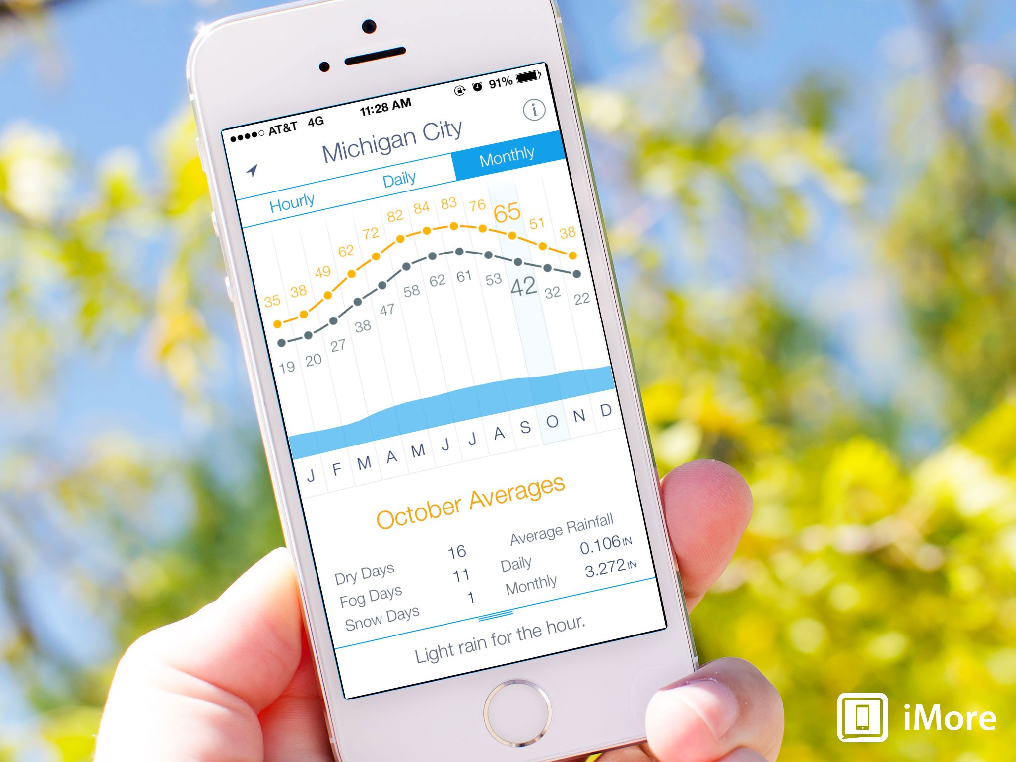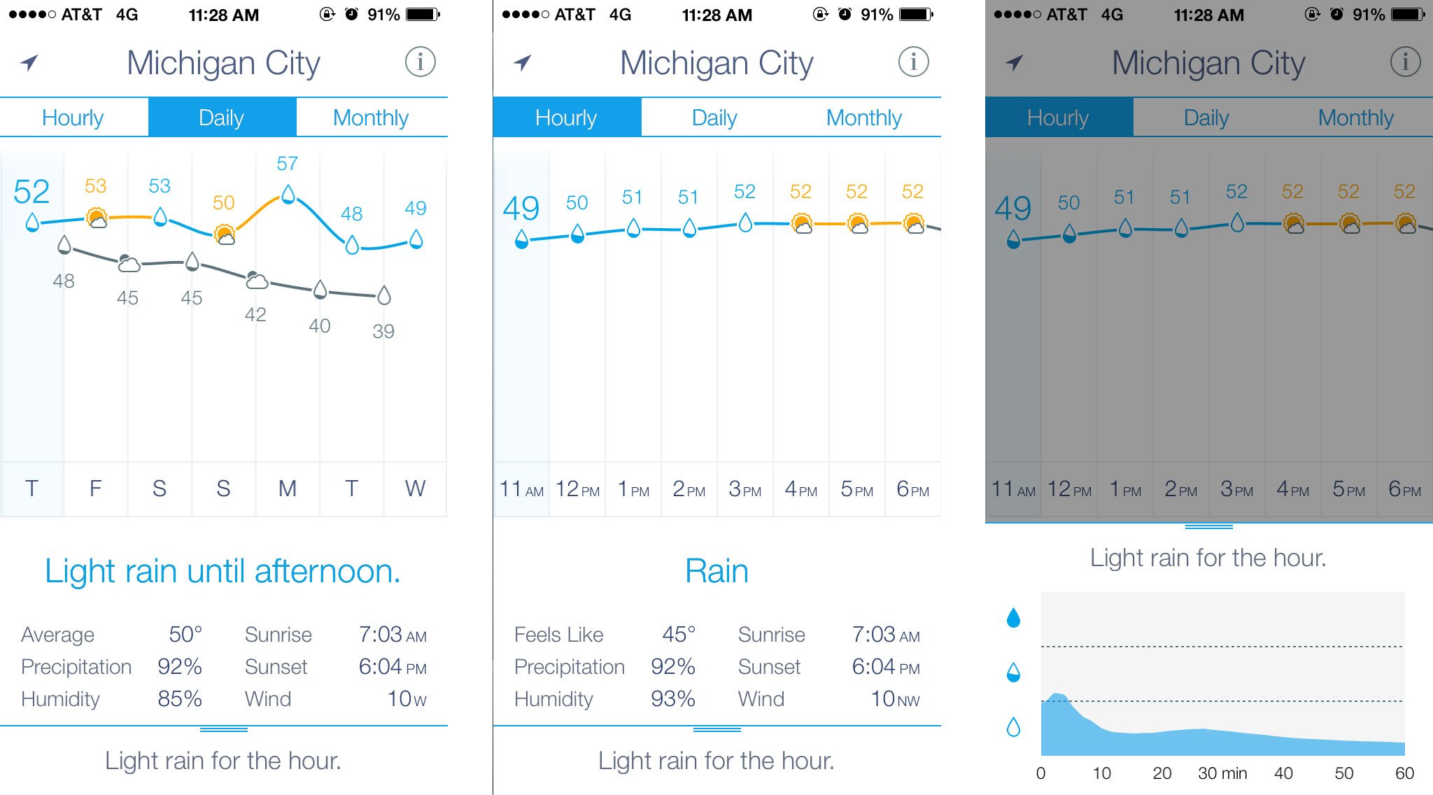
Weather Line is an impeccably designed, delightfully crafted weather app that comes from another one of those director, developers, designer trios that seems to be working so wonderfully well lately. The director for Weather Line, Ryan Jones, was gracious enough to expound on why the world needed another weather app, what iOS 7 allowed them to do with it, and what his role entailed.
First up, what did Weather Line bring the table that no other weather app captured before?
Ryan Jones: I've literally had [the idea for Weather Line] in my head since the first time I saw the Stocks.app in iPhone OS 1. I thought [the interface] was obvious and someone would do it. Maybe even Apple. Then I thought I was an idiot and there was an obvious reason no one was doing it. That I was missing something. Then I thought it wasn't "different enough". That there were too many good weather apps, and a better presentation may not be enough to sell apps. Then I finally said "I just have to know the answer, I'll make it myself."
A couple apps have tried a graphical [weather] view, but either only on the iPad where there is more space or by going from the Hi to the Lo every single day. I won't call them out, but you can find them easily. That just plain doesn't work.
More so, no one had my idea of putting the condition as the data point. Which I thought was really elegant and a great way to get more data in less space. We can show the temperature, the condition, the trend, and the rain chance/intensity all with very very little information and screen space. If you think about a table or list, which is what most apps use, it would be 36 rows and 4-5 columns. Not including the trend, which is arguable the best part.

What, if anything, did iOS 7 allow you to do that previous versions of iOS wouldn't?
Ryan Jones: As an app that job-to-be-done is "quickly present data", Apple's movement to defer to the the content was huge for us. We removed chromes and tiles and shadows and labels.
iOS 7 gave us permission to remove the Pagination Dots. In iOS 7 Apple signaled that users are to be trusted with common interactions now. We are no longer hand holding users, and the base layer of interaction is considered common sense. Some really great beta testers (with famous apps) push back on this, but of the 100+ feedback emails I've received, not a single one mentioned this. That could be self selection, but it's meaningful. I think Apple is right, users "get" the basics.
We had Backgrounding implemented but took it out. (this next part copied from site) We tested and considered it deeply. However, weather data actually changes too rapidly. If we updated in the background, we would still have to update again when you launched the app. So then we'd just be wasting your battery with a background update that we never used. The best experience comes by refreshing data as fast as possible when you launch the app. And we did, it's very fast.
How did you like being an app director?
Ryan Jones: I was worried, big time. I tried to learn to code about 3 times and totally stalled right away. So I just had to hire. I looked to guys like David Barnard who basically paved the way.
It was a challenging when trying to explain my point of view to really famous and awesome designers like Pacific Helm. I would explain my ideas, but I felt like - who am I? I can barely use Photoshop, what do I know? But they were great, and tried my ideas that had potential, and explained ideas that were naive and just couldn't work.
I got incredibly luck to find Mircea (my developer). I had a detailed Work Spec that I sent out, but his response stood out - he immediately "got it" and shared my vision. He would often surprise me with new features he created on his own or take the time to explain why something did or didn't work. Sometimes he would send me a beta, I'd play with it and ask him to try a few things, then we could end up exactly where he started. We did that with the spacing in the Details area. That was iterations an entire day with vertical spacing, text size, horizontal spacing, white space, edge padding, center column padding, etc. We ended up almost exactly where he started. Once we had that trust, I knew he was the one in the code, he had the same eye for details that I did, so he had tried those iterations and picked the best.
Thanks Ryan! The thoughtfulness is obvious in the app!
You can find Weather Line in the App Store.
- $2.99 - Download Now
Similar Articles: philadelphia eagles monday night football Amanda Rosenberg Hannah Anderson Jennifer Rosoff


No comments:
Post a Comment
Note: Only a member of this blog may post a comment.